ProjectsThis Site
This Site
The site you're on - a Next.js portfolio designed in Figma first, built to hold an engineer's work, a designer's eye, and room to grow into content, all under one aesthetic.
A site built to hold more than one discipline at once - and to make that feel deliberate, not crowded.
I wanted a site that actually represents me - and I wear a lot of hats. Software is the main one, but I also design, make things visually, and want room to grow into content creation down the line.
So the brief I set myself was simple: one place where those different sides can sit together without any of them feeling bolted on. The aesthetic had to be strong enough to carry an engineering case study, a resume, a wall of recommendations, and eventually creative work - all under the same roof, none of it looking like a guest.
Designed in Figma first
Before writing a single component I laid the whole thing out in Figma - every page, its hover and expanded states, and how the fixed identity sidebar relates to the content scrolling beside it. Designing the file first is how I build front-ends in general: decide what each screen shows and how it's arranged while it's still cheap to move things, then treat the build as execution rather than a running argument about layout.
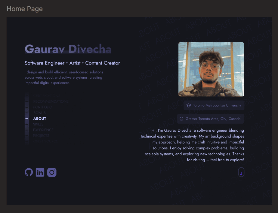
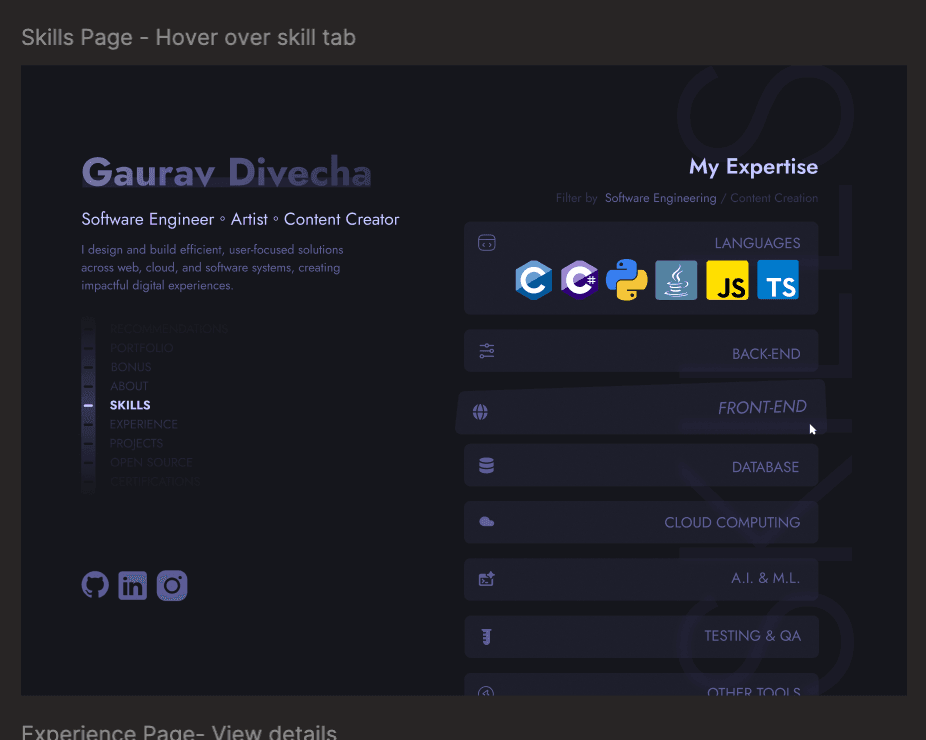
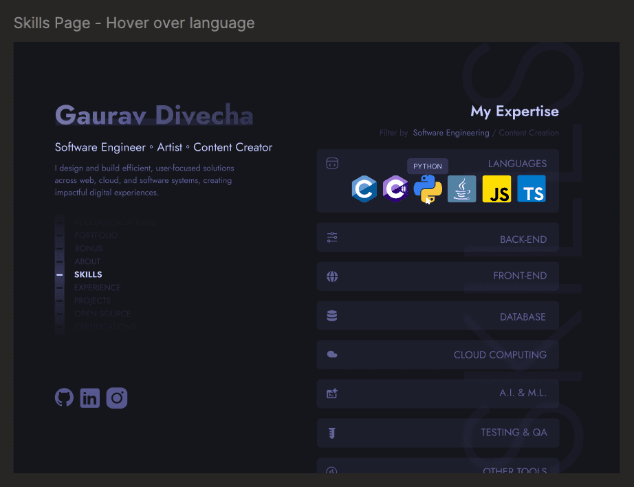
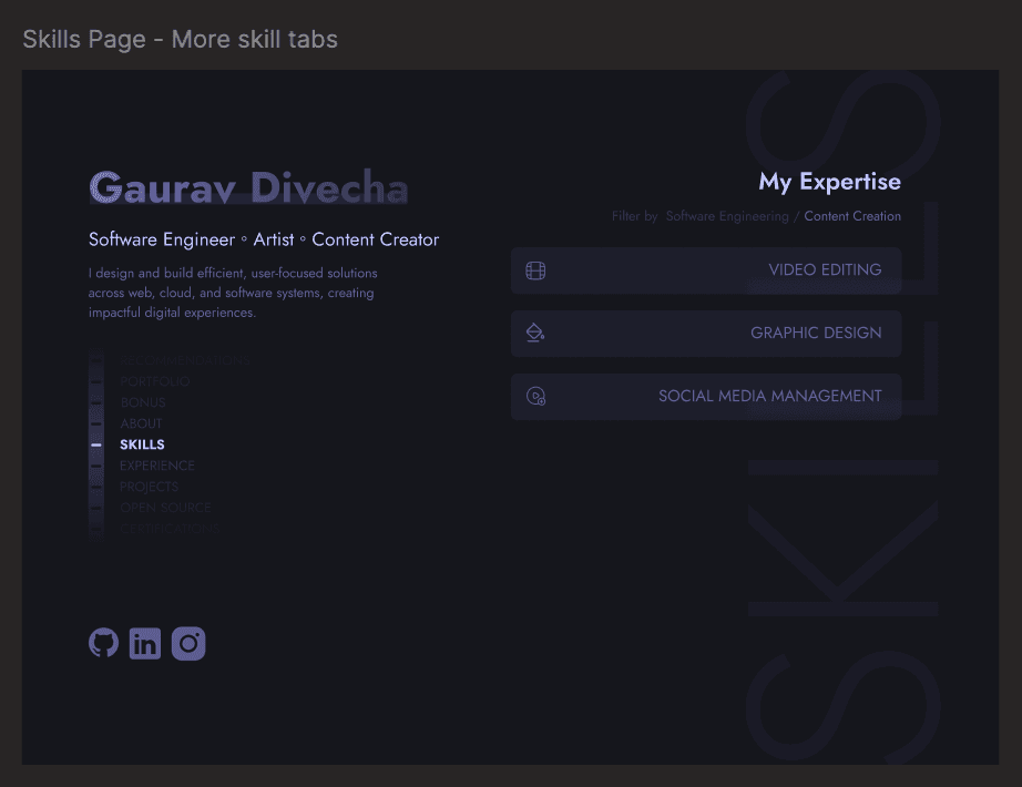
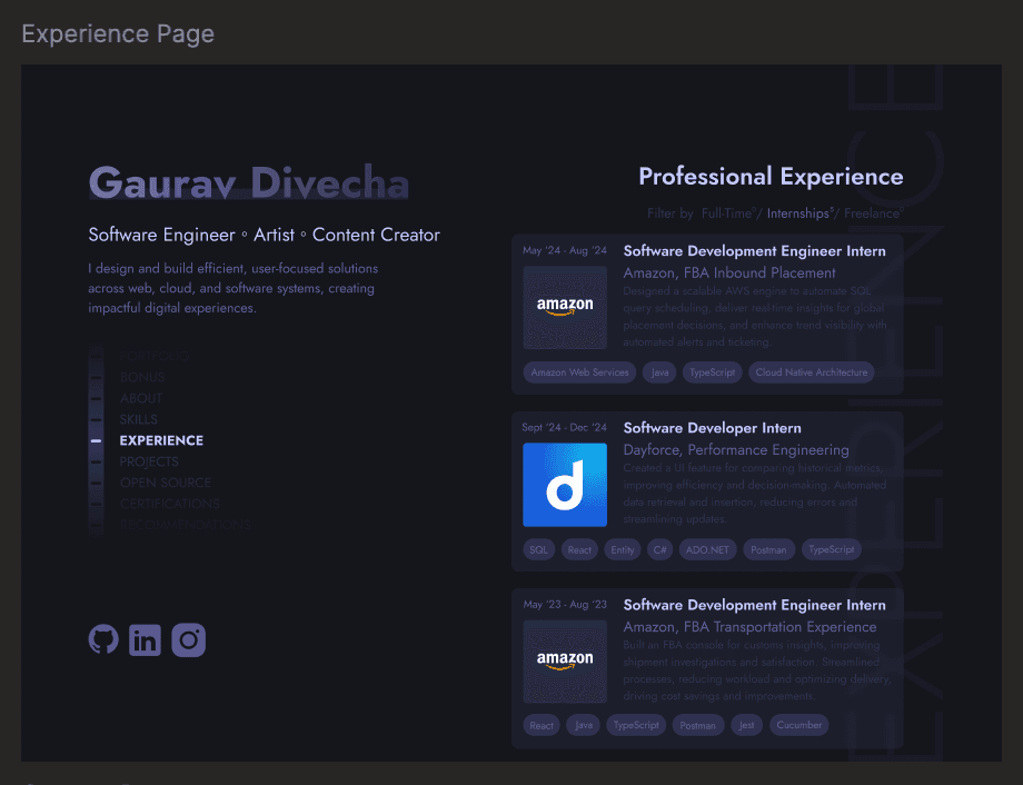
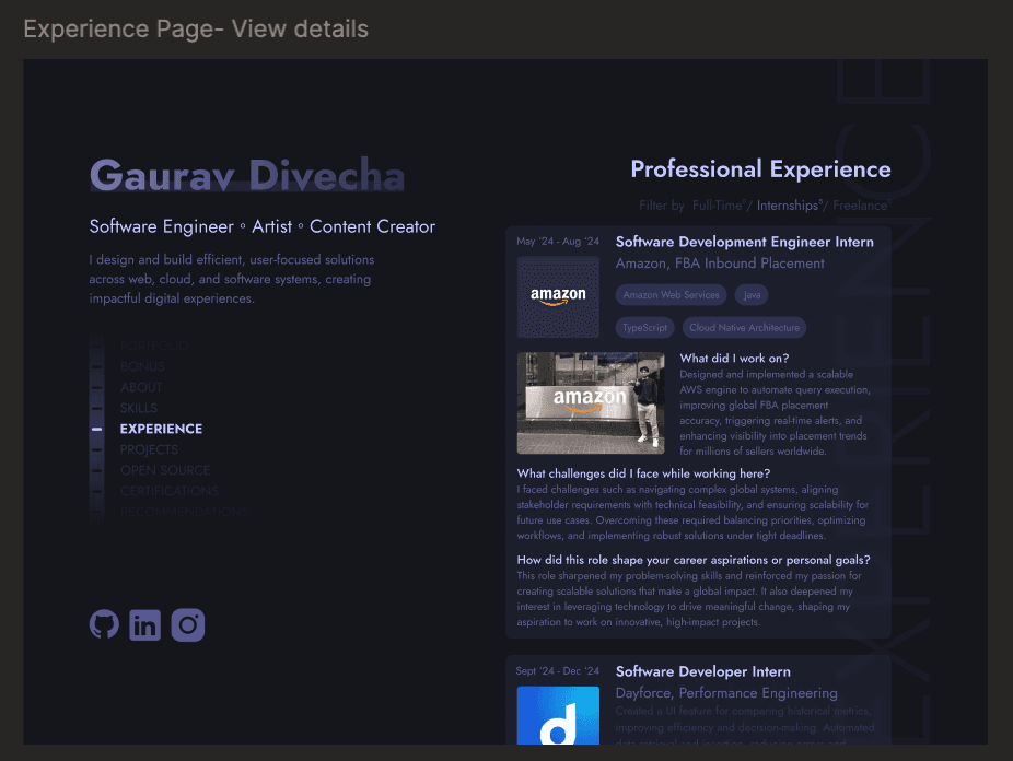
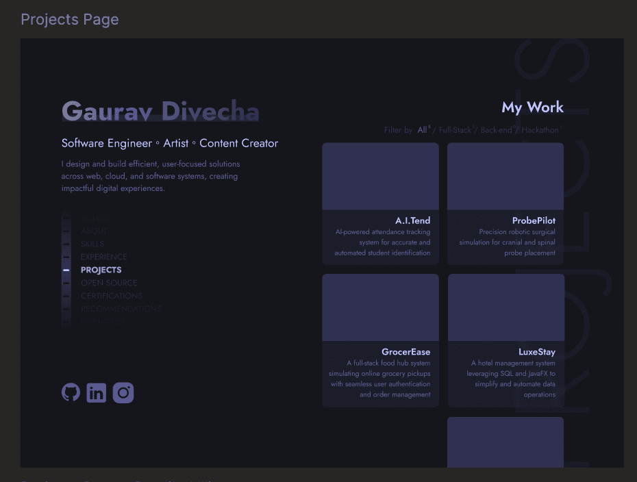
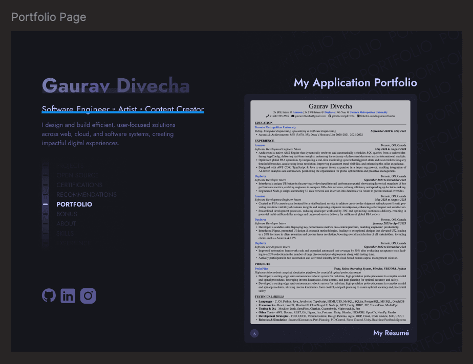
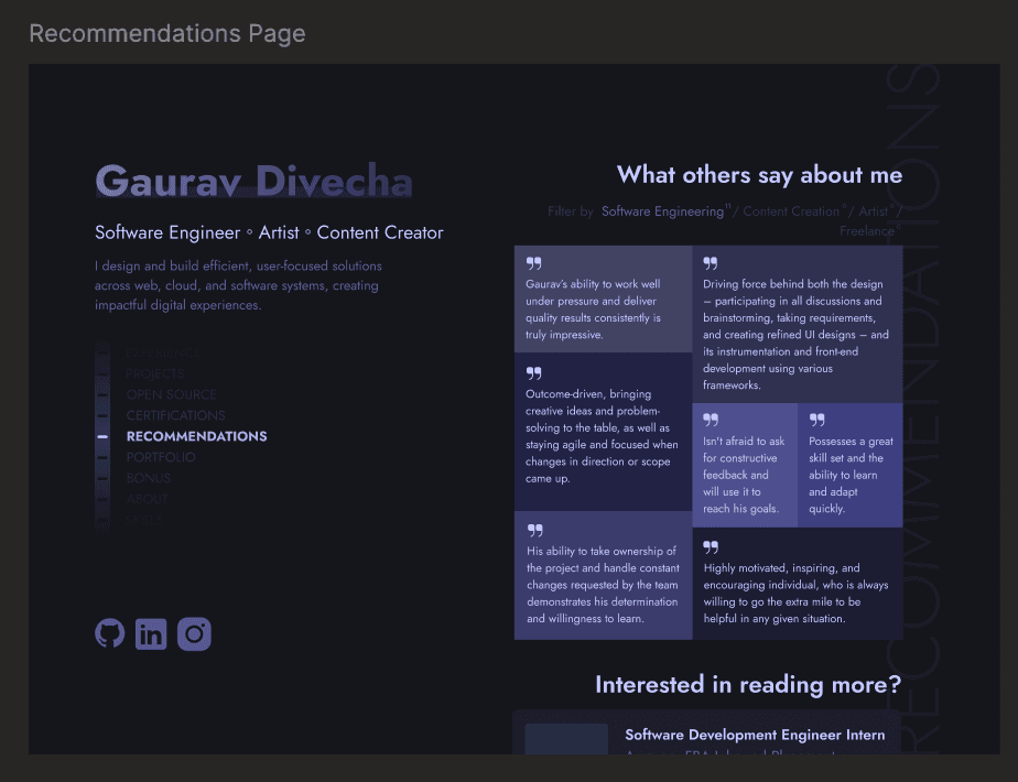
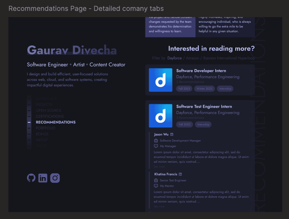
Home - the per-section watermark treatment
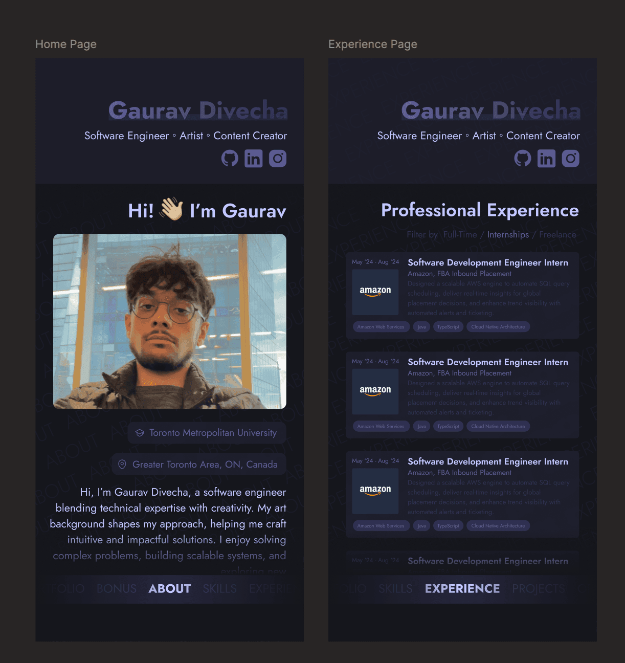
And the same frames narrowed down - the vertical navigation becomes a bottom bar and the identity stacks above the content, without anything getting cut or rearranged into a different layout.
One identity, many sections
The sidebar holds the constant - name, roles, socials - and every section is a different lens on the same person, styled the same way: My Expertise, My Work, What others say about me. A skills filter that flips between Software Engineering and Content Creation. An experience list that opens in place instead of routing away.
That consistency is the whole trick. It's what lets a video-editing skill sit two rows below a distributed-systems one without either looking out of place - the frame is strong enough that the contents don't have to match.
What it’s built with
Next.js and TypeScript, styled with Tailwind, no CMS - the content lives in typed data files, so a new role or project is a few lines rather than a migration.
The small things are hand-built: the navigation dial, a container-query layout that reacts to the sidebar's own fluid width rather than the viewport, and synthesised UI sounds. Most of the implementation was done by directing AI coding agents against a tight spec - the same workflow I use on real features.
No source link - it’s my own site. The Figma file above is the honest version of how it came together.
© 2026 Gaurav Divecha. All rights reserved.